


Opinion on NHL Reverse Retro Jerseys
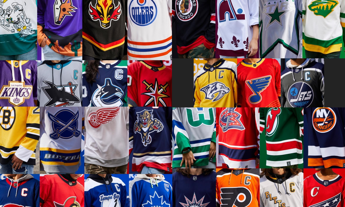
All of the new NHL Reverse Retro jerseys
In this shortened NHL season, the NHL is making efforts to expand their profits. A new way of doing that is through brand new uniforms! In early November, the NHL and Adidas unveiled the league-wide campaign for the “Reverse Retro” jersey, which will give every team a new uniform that may reflect on the team’s history, while being “remixes for the future”. Today I will rate all of these jerseys out of 10.
Anaheim Ducks
It looks weird, I hate the number and letter fonts. This looked like a terrible effort to appeal to the younger generations, but I don’t get the hype at all.
(5/10)
Arizona Coyotes
Another asymmetrical jersey, I did not point this out before, but I think asymmetrical jerseys look awful, and the purple is SO not coyotes. I love the other jerseys they brought back from the 90’s, but these are quite bad.
(4/10)
Boston Bruins
I actually like this jersey a lot, the logo takes me back to the 90’s. I think going primarily gold here looks overall good, but I don’t like the little white part on the sleeves though, in my opinion that was unnecessary.
(9/10)
Buffalo Sabres
I like how the organization has moved back to the gold and royal blue colors, but I am not a fan of this jersey here. They could have gone with the late 90’s design instead of the words across the bottom stripes (which is also from the 90s I believe)
(6/10)
Calgary Flames
I’m not used to their late 90’s alternate logo. it seemed like a myth to me back then. But now we’ll get to live it. The bottom part of the jersey is a lot of unfilled space, they certainly could have done something with that. I like the shoulder logo. (C of white)
(6.5/10)
Carolina Hurricanes
They went to the Hartford Whalers (the Whalers were a team that they used to be but relocated) design a year or two ago, I love the colors and the fact that they are respecting the team they used to be. But this jersey is disappointing. I would have been happy if they went with white, but grey? Why?! It’s very unexciting now and just awkward.
(6.5/10)
Chicago Blackhawks
This jersey is very plain, but it actually looks kind of interesting at the same time. I would have gone to the striping around the chest as well as the old school logo. Again it’s plain but visually appealing as well.
(7/10)
Colorado Avalanche
I really respect the Avalanche for going back to the Nordiques (the Nordiques were a team that played in Québec City in the 80’s and 90’s) logo, the people in Québec will either be really happy or really mad about seeing the fleur-de-lis on an American team’s jersey. But this jersey is VERY cool. The reddish/maroon color looks great with the logo as the red swaps out the blue. And the numbers are the same as the numbers on the jersey the Québec Nordiques wore for nearly 20 seasons.
(9.5/10)
Columbus Blue Jackets
This jersey is quite... interesting. I don’t think it’s a bad jersey but I don’t understand the inspiration for this jersey. It looks kind of awkward, and looks like something the Washington Capitals would wear to be honest.
(6/10)
Dallas Stars
At first I was disappointed but after seeing how just about EVERYTHING on this jersey will be white, I really can’t come up with a better concept. I also think this was a missed opportunity.
(5/10)
Detroit Red Wings
This jersey sucks, there is not much to say about this one. I understand it is a tribute to the dynasty the Red Wings had in the 1990s. But I think we should get an even older throwback, something to the pre-Gordie Howe days or somewhere during that time. But it’s the same design over and over again. And the creativity is nearly 0.
(2/10)
Edmonton Oilers
Bias aside. I do like this jersey, but it’s only a matter of time before the “retro concept” of the Oilers jersey is milked to capacity. Would a 2000’s type jersey change the mood a bit? Sure, but that was the 2000’s, the dark ages. I wouldn’t go back to that. The creativity was really low here but the jersey itself is quite clean.
(8/10)
Florida Panthers
I like how they went back to the old logo for this one, but I haven’t been a huge fan of the Panthers’ jersey selections. The logo is intimidating and ferocious. And the jersey doesn’t look bad. But I’m still not a fan of the design.
(6/10)
Los Angeles Kings
This is an interesting jersey, a mix of eras from the dominated Kings of the early to mid 80’s and the contender Kings of the late 80’s and early 90’s. This is a bold jersey. It looks good. But that doesn’t mean I like it. While I love the purple and gold of the old Kings, I really don’t like this on this jersey. The textures look weird, it just doesn’t feel right.
(7/10)
Minnesota Wild
I like this jersey a lot, this jersey is quite clean and a tribute to the good old Minnesota North Stars ( the North Stars played in Minnesota from the late 60s to the early 90s before relocating to Dallas). The colors are cool, but I’m a bit skeptical of the logo. The logo would look best in my opinion if they used their alternate M logo. But the jersey itself looks great.
(8/10)
Montreal Canadiens
I dig this jersey, the Canadiens don’t have too much to work with in terms of alternate jerseys, but this one looks great on the ice. There is contrast, the colours look great, but I’m just not used to the concept of a blue Canadiens jersey.
(8/10)
Nashville Predators
This jersey looks kinda boring, I believe it is based off of their mid-2000s jersey design and colours. The colours look pretty cool. But some of the underarm spots look rather unorthodox. Not horrible, but not too exciting
(7/10)
New Jersey Devils
Originally I was a fan of their 1980’s design, with the red base colour and the green secondary colour. But I thought that this jersey was a little too “Christmassy”. Here it’s main colour is a darker tint of green. And the secondary colour is red.
(7/10)
New York Islanders
This jersey actually looks kind of cool. But this jersey is an overall disappointment, this is called a REVERSE RETRO jersey not a slight discolouration of their current home jersey. The Islanders wanted to pay homage to their dynasty of the early 80’s, but unfortunately for them they are wearing those jerseys right now.
(6/10)
New York Rangers
I really like the design of this one, it has the Statue of Liberty on the front crest. And they went with a darker blue and red that the Rangers wore in the late 90’s. Overall it is a fine jersey.
(8/10)
Ottawa Senators
This jersey does not look too bad, this season the Senators went back to their early 90’s expansion jerseys. This jersey has a lot of red, but overall does not look too bad.
(7/10)
Philadelphia Flyers
I really like this jersey, I Iove the design the Flyers had throughout the 80’s and 90’s. But instead of white, the collar-to-cuff stripes are black trimmed in white. While the jersey remains mostly orange.
(7.5/10)
Pittsburgh Penguins
This jersey resembles the alternate jersey the Penguins had in the late 90’s featuring the diagonal logo of the team’s name. The original jersey was black, and this one is now white. It is decent, nothing too special though.
(7/10)
San Jose Sharks
This is another jersey based off of an alternate jersey from the 90’s. It’s main colour is grey with teal and black. Again, nothing too special about this one.
(6.5/10)
St. Louis Blues
I love this jersey, it looks awesome with the colour contrast as the main colours are red and blue. This is based on the jersey the Blues wore in the mid 90’s when they traded for Wayne Gretzky. It is strange for a Blues jersey to be primarily red and secondarily blue, as blue has been a primary colour for all 54 seasons they have been in St. Louis
(9/10)
Tampa Bay Lightning
This jersey is based off of the one they wore when they won the Stanley Cup in 2004 against the Calgary Flames. Instead of black as the primary colour, blue takes center stage as black and white as secondary colours. The logo looks kind of dusty but kind of sick at the same time.
(8/10)
Toronto Maple Leafs
I think this jersey had lots of potential, but they screwed it up with the numbers and logo. It was the jersey the Leafs wore from the 1970s until the early 90’s. The base colour of the jersey is blue. With the collar-to-cuff design, the Maple Leafs made it grey instead of white. And now the logo and numbers are coloured blue and trimmed in grey. I think they could have done better. But it actually looks pretty nice anyway.
(8/10)
Vancouver Canucks
I was kind of disappointed when I saw this jersey. I was hoping for a remix of the great jersey the Canucks wore in the 90’s with their modern colours. But now they went with the jersey they wore when Mark Messier was there, Woof! Here. The base colour is a gradient of navy blue to green.
(5/10)
Vegas Golden Knights
You may think, How the heck does Vegas have a retro jersey when they have been around for only 4 seasons? Well, Vegas had an International Hockey League team that played in the 90s. So, Vegas took that jersey and remixed it with their colours. Making the base colour red.
(7/10)
Washington Capitals
I am not a huge fan of this jersey, here the asymmetry gets on my nerves. As well as the colours just don’t look good on this jersey. Their new alternate is far superior.
(5/10)
Winnipeg Jets
I like the idea the Jets had with this jersey. But I don’t think the colours work here. The Jets are using the jersey they used when they competed with the Oilers and Flames in the 1980s. I wish they used red, white, and blue. Instead of grey, blue, navy blue and white.

